Back to Homepage
Onboarding Redesign For BluSmart App
coping up with business expansion in new geographies
About this project
Overview
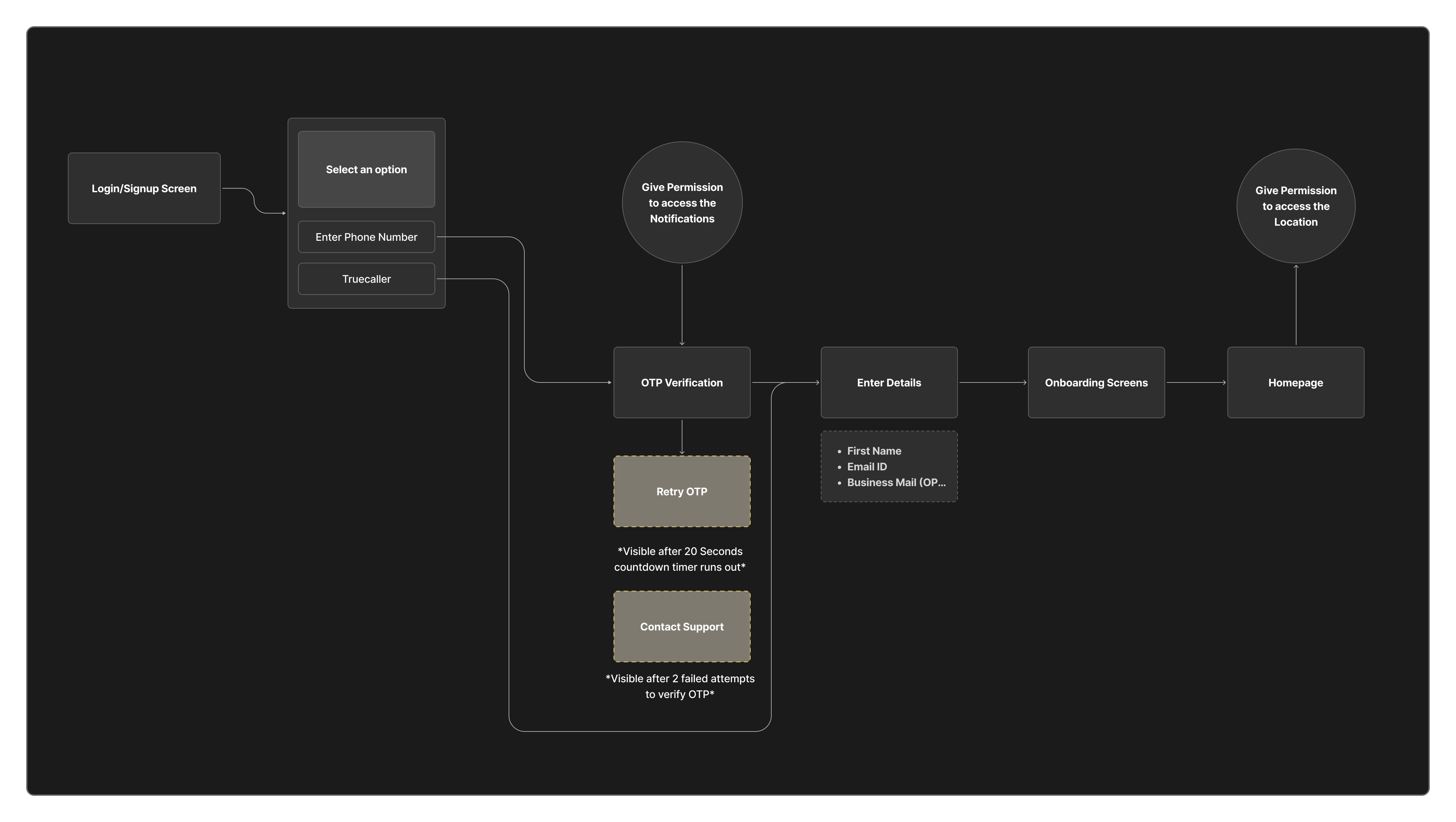
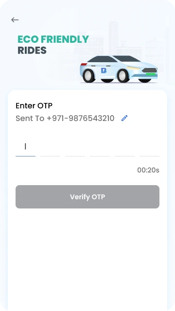
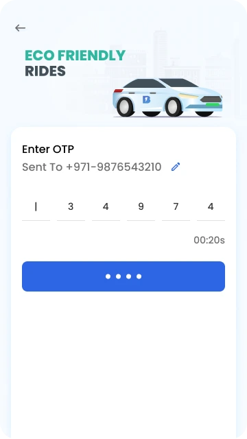
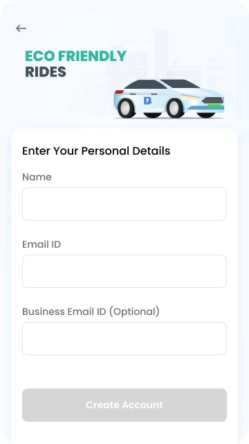
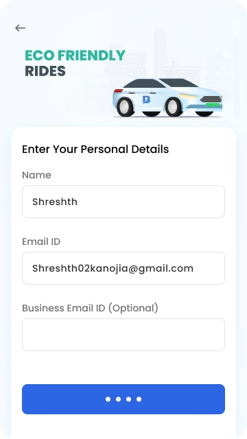
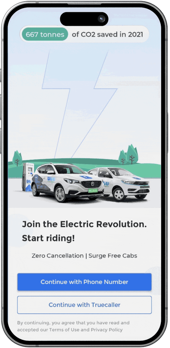
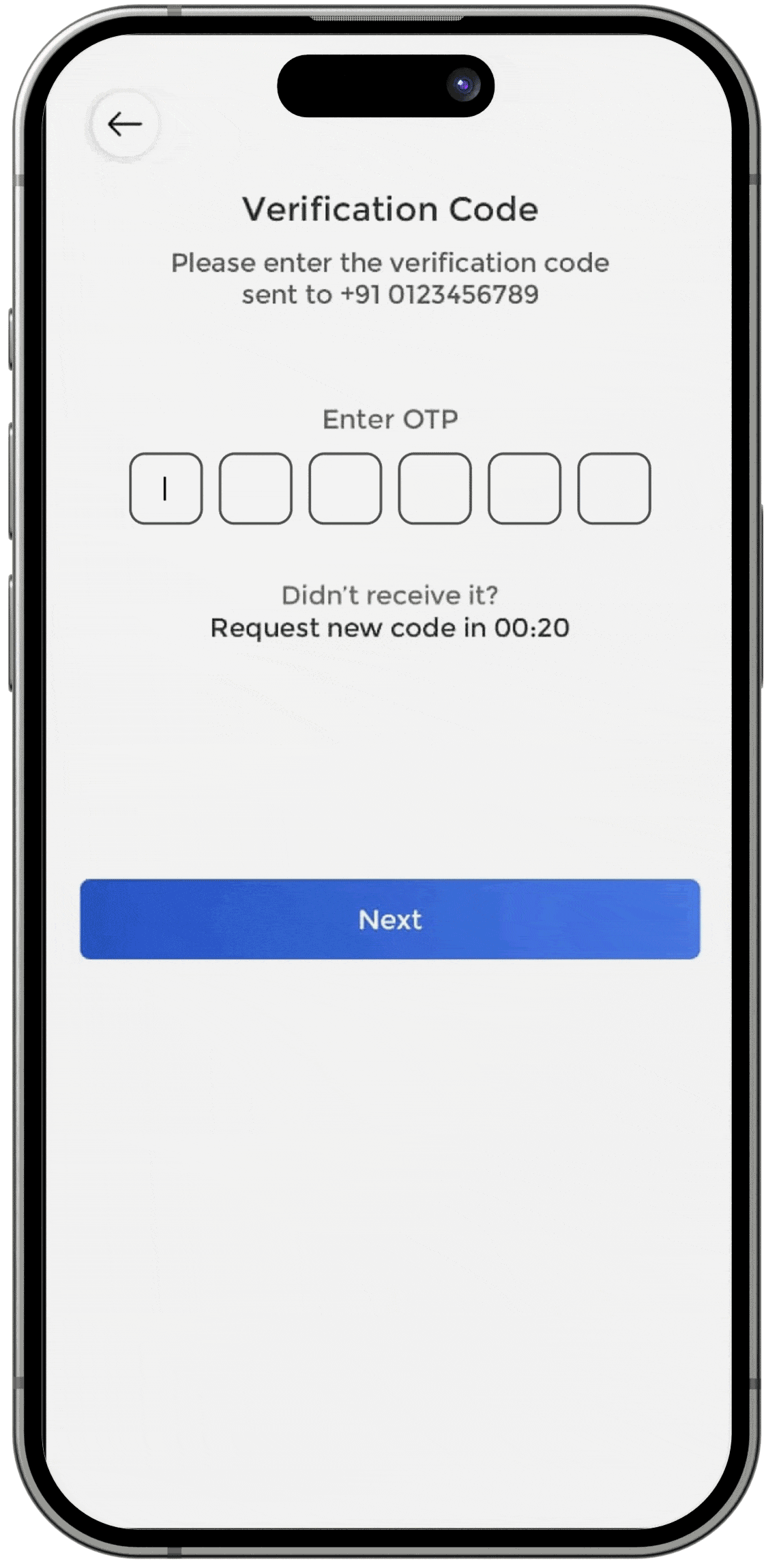
Back in 2023, BluSmart aimed to expand its business to UAE (Dubai).

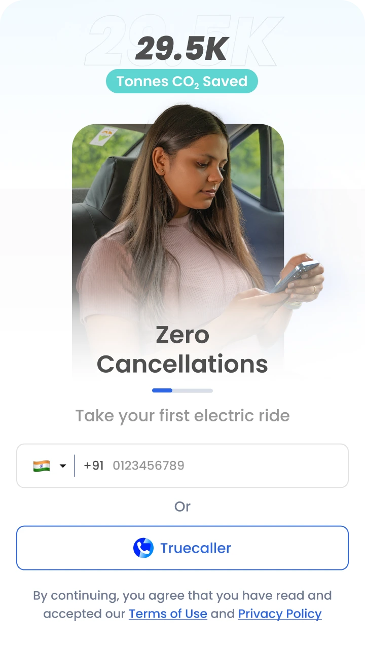
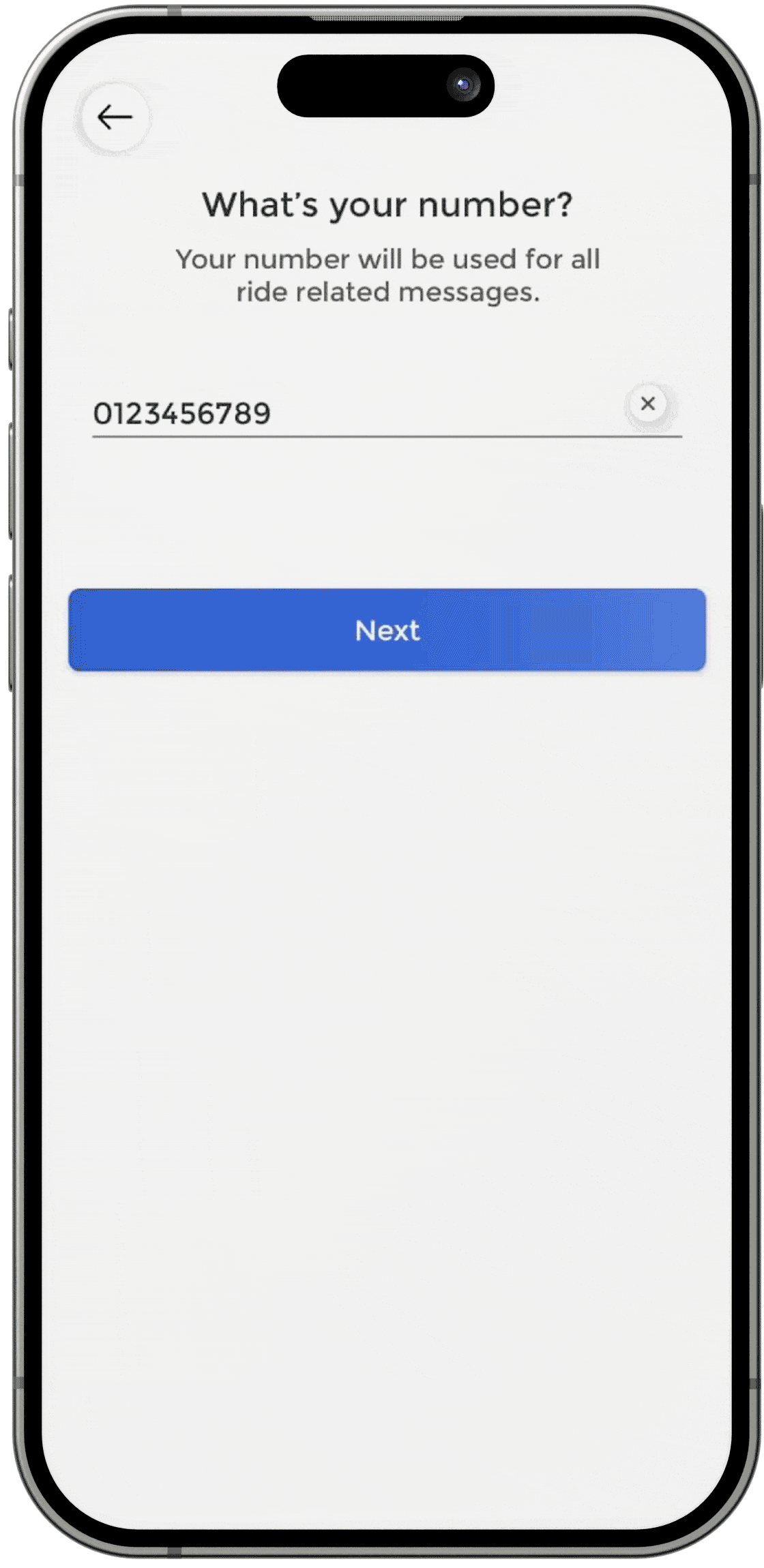
The app onboarding allows users from India only since it operates in Delhi NCR and Bengaluru only.

As a designer, I was required to improve the experience of current flow and make onboarding accessible for international users
My Role
UI/UX Designer
(Research, Wire-framing, Micro-interaction, Design Testing)
Timeline
1 weeks (June, 2023)
Published on August, 2023
Research
In this steps, we needed to define the areas where we need to work on according to users, competitors and our existing product
1. Competitors Benchmarking
Competitors Benchmarked
Key Takeaways
Country code selection shall be included to make it inclusive for international users visiting Dubai (UAE)
Google Account (Android) or Apple ID (iOS) login can be helpful for smooth signups
2. Evaluating existing onboarding experience
Swipe to see more screens
Problems with existing flow
Initially there is a choice of login/signup and second screen can be avoided by giving phone number text field right in the initial login screen
Region selection shall be included in the first signup itself
Too much white space in subsequent screen, this space can be utilized better
UI components seems quite old and doesn't feel interactive
Copies can be improved and placeholder can be better to improve UX
Taking last name is irrelevant and is not a must have or important information to know
3. Target Users
Demographics
Age ranging from 21 years - 40 years
From America, UAE, Russia, Europe, Canada, India, Middle East, South Asia
Owns a business or work in a company
Travels regularly to India and Dubai (UAE)
Painpoints
International numbers are often a hurdle to sign up for services
Language barrier is there for foriegners
Safety concerns in another country
Difficulty in navigating new regions
Ideation and Iterations
After Identifying the key areas to work on, I prepared optimised flow and new UI Elements to use
Optimised Flow
After discussing various solutions with developers and stakeholders, we came up with this flow which was easy to implement according to existing architecture and tech feasibility
Iterations for Initial login screen
# Iteration 01
- Experimentation with Dark theme
- Reliability and Legitimacy of Brand from Total Rides Completed
- User testimonials to showcase brand loyalty in current geography
# Iteration 02
- Adding value props in carousel format
- Adding an open text field for phone number as 90% users loging through it
# Iteration 03
- Adding reason to communicate user how their data will lbe used, to get trust of users
- Added two value props in a single static place
# Iteration 04
- Added people according to specific geography to make it relatable
- Added coupon to make the first time offers more visible for the users
- Highlighted main usp i.e CO2 savings through our cabs so that they feel good about it
Final Flow
Incorporating all the things. Following wireframes were finalised
Login Screen
- Made phone number upfront
- Added an arrow to proceed to phone number entered
- Added country code selection according to which placeholder text changes
- Added animation to arrow for better feedback
- Also moved permissions popup to OTP screen
OTP Verification
- Resend OTP will show up only when once failed attempt to verify OTPĀ has been made
- After two failed attempts to verify OTP, users can connect with customer support and escalate
Enter Details (in case of new user signup)
- Removed last name because that is not a mandatory information as phone number and name
- Email is required for ride receipts
- Business email is optional and user can add it anytime, this is necessary for business users
Onboarding Screen
- Onboarding screens changes as per pickup location or live location of the user (For eg Pricing and Serviceable Regions)
Live Recording
Here is the live recording of onboarding flow in action on production
Thank You